Showing posts with label keith howell. Show all posts

Friday, February 13, 2015

I THINK, THEREFORE I COLOR is Available Now!

https://www.facebook.com/colormesmart

I THINK, THEREFORE I COLOR is the first (of hopefully many more) official publication under the INTELLIGENT DESIGNS™ imprint.  For only $9.99 this educational coloring book features striking caricatures of 50 notable philosophers everyone should know. Spanning the ages from 551 BCE to the modern day, these great thinkers and teachers deserve your awareness and your mad coloring skills!

You might ask why I would say in the title of this coloring book that “you should know” these 50 individuals.  I believe philosophy is a very important field of study that strongly differentiates us humans from other animals.  We, of all the animals, have abstract minds that contemplate the unknown and even the unknowable.  In philosophy, oftentimes the questions being asked are much more important than the answers that may or may not come.  Philosophy can be a mirror of our own lives, which are wild journeys of discovery, if we all just open our minds’ eyes to see. Like great poetry that inspires our emotions, studying philosophy inspires the mind and the heart by sending our creative tendencies inward where all personal growth begins.  I believe putting a human face to it (through this series of caricatures) is a good way to associate and remember basic philosophical understanding.

The purpose of this coloring book is simply to have a little fun while also being educated.  As many a parent knows, sometimes the only way to get a child to eat her peas is to hide them inside bites of mashed potatoes.  The best teachers and students realize that learning is much more effective when it is also fun. Faces are interesting to look at and are fun to color—and the backgrounds are open to your limitless imagination!  So, if you complete this coloring book you will be exposed in chronological format to 50 great philosophers from Confucius to Camille Paglia. 

The criteria used for choosing these particular 50 is entirely based on my personal preferences.  This is not to say that inclusion in this book is endorsement of their philosophies but to acknowledge that their influence is, or was, very important and influential.  Some of those included are not commonly listed as “philosophers” but I made sure that I could find academic support recognizing, and encouraging acknowledgement of, each one as an influential philosopher of note.

I have included with each entry the person‘s birth and death dates, a selected field or school of philosophy that they are recognized for, a few highlights of their personal interests, and a personally selected quote.  I’ve included a Footnotes section that provides sources for each quote but can also serve as a de facto “Suggested Reading” section for anyone wishing to dig deeper into these individuals and their philosophies.  The Glossary pages define some key terms used in this book so that colorists who are new to philosophical musings can enhance their understanding.

Anyone from age 13 to 130 should be able to enjoy this book as much as I enjoyed creating it.  Let your imagination run away with you on the backgrounds and soak in a little bit of key info about these great thinkers that you may or may not already be aware of.


Sunday, February 6, 2011

*FINISHED* Superman as a pastiche of Doc Savage

Finished piece depicting Superman and his supporting cast as a, sort of, pastiche of "Doc Savage" and his adventure team.

I'm envisioning them as a period concept, so it would probably still be in the 40s.  Hence the outfits on Lois, Jimmy, and especially Steve, who as an ex-sports star at that time would be making his living as a carnival strongman and bouncer.  I also thought it funny to put him in colors more reminiscent of the classic Superman costume. As well, the jodhpur pants on Superman and Supergirl date them from that 40s era as well.

The artwork was originally drawn in pencil, then inked with a brush and pen.  Then I scanned in the line art and layered in the color and effects in Photoshop.  The color scheme I chose for Superman here is still red and blue but desaturated and textured to give it more of an earth-tone, though I retained the full red and yellow for the "S" shield on the chest.

This was kinda fun.  I like my friend, J.R.'s suggestion of depicting his arch-enemy...who would be a red-headed female version of Lex Luthor with a gang of Bizarros.  I don't know if I'll be inspired enough to depict them.  But I sure like the concept.

Hope everyone enjoys this one.

Sunday, January 30, 2011

The Worlds of Philip Jose Farmer -- Creating a Cover


About a year ago, I embarked on a project that I was excited to be a part of.  I was approached to create a cover (and a title design) for a new book dedicated to honoring and expanding upon the legacy of the late author, Philip Jose' Farmer in what came to be titled:  THE WORLDS OF PHILIP JOSE' FARMER:  PROTEAN DIMENSIONS.  I was re-reading Chris Roberson's fantastic contribution, The Final Flight of Greatheart Silver, and started reflecting back on this piece. I thought it might be interesting to show some of the steps it took to get to the final project and illustrate it with as many of the different stages as I still had files on and undeleted emails.  So, read on to gain a little insight into how I work.

I was initially contacted by my friend, FARMERPHILE editor, Michael Croteau about whether I might be interested, which I was.  This opened up a series of communications with a group of writers and editors, and myself, in trying to generate a creative spark within me.  At the time, the intention was to continue the recently concluded FARMERPHILE magazine with a series of book-sized FARMERPHILE ANNUALS.  I was working on another project at that moment and wasn't able to give serious consideration to coming up with a cover concept for this FARMERPHILE ANNUAL.  I wasn't inspired....but I wanted to be.  As the conversation between the team evolved, the concept behind the FARMERPHILE ANNUAL also evolved and one night I got dinged on my cellphone with an email.  That email from Win Eckert proposed something wild.  He proposed letting the FARMERPHILE name rest and naming it THE WORLDS OF PHILIP JOSE' FARMER as a way of marking it as something new.   The plan changed to a series of yearly annual anthologies called THE WORLDS OF PHILIP JOSE' FARMER and demark them with subtitles.  The first volume being THE BITE OF THE ASP (though this was later changed to PROTEAN DIMENSIONS).  And the rest is now history.

And I had a concept -- a space scene depicting the various planets from Phil's many different stories.  Which is a great idea, however, what I realized as the artist was that pulling back far enough from the planets to incorporate more than just a couple of them meant that a lot of the detail that you would expect from, say, the Riverworld or The World of Tiers, are going to be lost.  So, I was going to take steps to try to give the planets textures that distinguished them from each other and look alien, but I knew that identifying them was going to be something probably only I would be able to do.  But I thought it could make for a cool design, basically an entire solar system of different planets than our own.  The only direction I had received at this point was to avoid putting faces on the cover, to distinguish this book from fanzines and pulps.

Can you tell this used to be Venus?
First thing I did was grab a public domain space photo of Orion to manipulate for the background.  Then I went into Wikipedia and grabbed a public domain hi-res grouping of planets, Mercury, Venus, Earth, and Mars.

Then I isolated Venus, Mars, and Earth respectively...and manipulated and tweaked them within Photoshop.

Earth forms root for Riverworld.
 
These would form the basis for my solar system.  I pulled these elements into Photoshop and experimented with a color scheme.  I decided that I wanted to go really bold with it and give this otherworldly design a fiery look to it.  I thought that it would distinguish the look of the book to be bold and hot with the color scheme.   I also took this old photo of Phil and "ghosted" it into the image for the back cover of this wrap-around cover design.  The way I feel about it is that Phil is basically the "God" of the worlds he created and I wanted to give that sense of him looking out over his creation from on high.  Lots of manipulations, texturing, brushstrokers and effects later...below is the initial design created in layers on Photoshop.


 I provided a mock-up with an idea for the title design where I scanned in Phil's actual signature and tried to utilize that in the title itself.  In my mind, I was trying to emphasize the "Worlds" aspect in the title, and that's why it is so prominent.  I chose "Maximo" as our title font, and that stayed through to the end.

I received back some good feedback.  Mostly positive.  However, the planet that I created for the most prominent foreground position was liked the least.  My thinking on this was that we were going to be listing the contributing authors on the cover, so I wanted something that would not detract from that.  However, the visceral reaction was not good.  So, I needed to keep that in mind.  I was also encouraged to maybe try making one of the planets more obviously, say, Riverworld and maybe make one into the Lavalite world which "could have a mass ripping away from one side and other mass crashing into the other side (about the size of the moon next to that red planet, under Farmer)."  I also received back a mockup from Chris Carey, following the old basic FARMERPHILE cover design, showing the cover text at that point so I could have a visual to go by on what kind of space is needed.

I liked the visual of the Lavalite world cracking apart.  That gave me some solid direction creatively.  I received some direction on the title design that included dropping the signature font, reducing "Worlds", adding "The", making Phil's name more prominent, and adding "Protean Dimensions."  I also received some growing interest now in moving Phil's face to the front...but nothing firm on that yet.  After much Photoshop tinkering, this was the second round on the cover design, incorporating as much as I could in terms of suggestions.  Basically, my color-enhanced Earth became, in my mind, the Riverworld...and Mars became my base planet for the Lavalite world as I went in and played with the color and textures, then blew it apart by having our color-enhanced moon smashing into it.  It also occurred to me that a hi-res photo of Mars could be used as a good base image for creating Darkseid's "Apokolips" in Photoshop....but that's for another day.


Based on feedback, I rearranged the "activity" onto the back cover mainly.  I enlarged and brightened up "Protean Dimensions", added James Gunn to the contributors and enlarged the font size on that as well to make it easier to read.  At this point, I was starting to feel like the book was going to wind up with one of those covers that was going to basically be a starfield with text.  That was disappointing to me.  I didn't like how the planets seemed now to be so randomly thrown together onto the back cover and Phil's face was starting to feel superfluous to the design.  I needed some feedback at this point, and I got it.


The next round of feedback, I was told that "the lettering looks great, but we're still not crazy about the cover art. Especially since there is now a big "dead space" right below "and more" which makes you wonder why we didn't just keep listing names."  I was glad to hear the news about the lettering, and I agreed about the art at this point.  So what did they want me to do now that we were coming dangerously close to deadline?  I was asked to take Phil's face and move it to the front and shift the "Stories and essays" text  down towards the yellow text and, if possible, "to take the layer with the stars and shift the colors more towards the blue spectrum?"  For, as I was told,  "the more we keep looking at this, the more tiring the red becomes."  Ouch.  Haha.  Part of the game of commercial art.  I, personally love the red spectrum...but I'm also a bit of a "Fire" personality so that makes sense.  But I was confident I could make the blue spectrum shift work.  As I was working on these changes, I received an email from Mike that finally gelled the whole idea for me.  In it, he asked me "How hard would it be to arrange the planets to give the impression they are spiraling out of Phil's mind?"

Eureka!

That's what I needed right there.  I immediately knew what to do.  And this is what I came up with:


This one worked on all levels for me and, I hope, for everyone else.  We were running right up on deadline by this point, so I laid it out and worked it up to the publisher's specs and isolated the graphic elements in gray tones so that Mike could use them within the book to spice up the page designs and we had a book cover. THE WORLDS OF PHILIP JOSE FARMER: PROTEAN DIMENSIONS featured a cover image with the sparkling mischievous eye of Phil looking straight into the reader while worlds of creativity are bursting from his mind like Athena bursting out of Zeus's head.


Friday, November 19, 2010

Austin Comicon (WizardWorld) SHOW! 2010 Report


AUSTIN COMICON 2010

DAY 1

Ah. A beautiful morning. Get to sleep in a little bit. Drive the boy to school for play-off pep-rally. Back home to shower and leisurely pack a large duffle bag. Slip all my credentials and info into a nifty Batman folder bought from Wal-Mart. Slip on my Legion Flight Ring and all is a-go. Ran to Duke's BBQ with the wife and daughter for a yummy breakfast taco and a short-stack of pancakes. Said my goodbyes and I was off....well, I had to swing by Kohl's on the way out of town to pick up an awesome tee with the cover of SUPERMAN #300 on it cuz all their character tees were half-price! Came in a cool collectible tin also emblazoned with that classic cover. I remember buying that comic when it first came out in 1976. It was a personal favorite imagining what it would be like if baby Kal-El had landed on Earth in 1976 and become Superman in the future of 2001. I made the mistake of "loaning" that one to the kid across the street, cause I was a nice kid and he was sick. He moved away without ever returning it. But I don't hold grudges. Except about that. Still one of my favorite covers.


Easy drive in. Sunny. Found a parking lot close by for $5 and headed in just as the gates opened wide. Walked right up to the press booth to get my wristband for the weekend and headed inside. Man on a mission. Snapped some general pics of the entrance as I walked in, no crowd at all yet so I strolled right up to the Bionic Woman (Lindsay Wagner) and Oscar Goldman (Richard Anderson). Wagner is still gorgeous and seemed terribly shy. Difficult to get a conversation going at first. Lots of awkward, nervous smiling. So, I introduced myself. Told her I was here on behalf of Aintitcool but I was buying the picture and an autograph for myself. She asked what I did and I told her I write reviews and do interviews and that I'm an artist. That was a point of interest. She wanted to know what type of art and she seemed to like the fact that I still do it old-school and then scan the art in to digitally manipulate and/or add color. Gave her a business card with my website address on it and in a Columbo-moment asked one other thing...could I snap a picture? She gets nervous. The lady with her gets stone-faced and clipped. I think, did I say something wrong? So I mutter out..."for the website?" Wagner looks at the other lady like she's hiding Jews in the basement and I just showed up wearing a swastika (I make the Nazi-reference for reasons that will become clear later). Awkward silence hung in the air and then I just shrugged and said "Really, its no prob..." Then the other lady interrupted in a mollifying tone that "Well, there's the paid photo-ops and we're not supposed to..." And I said, "That's fine...I wasn't thinking in personal terms but for the website..." and smiled. Then the two of them looked at each other and said "Okay..." So, I snapped a nice picture. The fact that I was probably only the second person to talk to her made that possible. I promise that any later in the weekend, I would've been shut down immediately and likely had a cattle-prod shock to the groin.

Next up was Richard Anderson right next to Wagner. So incredibly nice and friendly and soft-spoken. Big genuine smile. Friendly handshake. I may have been his first customer. I bought an Oscar Goldman photo from him. I told him that he and everyone else from the SIX MILLION DOLLAR MAN show were a little bit of a lifeline for me during my formative years of '72 - '76 while my family was stationed in Puerto Rico. Everything on TV was in Spanish except for a handful of primetime shows that had the English audio simulcast over military radio, and their show was one of those. He wanted to talk about Puerto Rico. Nice visit and I moved along once others started lining up behind me.


The next few hours were spent scoping out where everyone was situated; getting a feel for the place. I promptly hit up Greg Horn to buy a gorgeous "Star Sapphire" print (and wound up buying a Vampirella print too...I'm a sucker for Vampi...have I mentioned that I have one of those life-size posters of Vampi from the '70s signed by Vampi herself?). I checked out Buck Rogers (Gil Gerard) and Wilma Deering (Erin Gray). Erin Gray has aged quite well and were I single and she willing...well, I'd canoodle a bit.


On to Mike Grell to buy a WARLORD print and get him to sign a copy of an issue of GL/GA that I am pretty sure was the first Mike Grell comic I ever bought. It's well-worn. Grell was drawing headshots for $50 and full figure shots for $100. If I was into that, I think it would be worth it. He also signs your first comic for free and additional comics are $1 for each. It's an easy way to keep away the ebay-ers because they hate anything that erodes their profit. Grell is an energetic guy with a nice tough-guy persona and an entertaining story to tell for each and every hand he shakes. A great guest. I'd love to see him on a panel with Howard Chaykin, another great storyteller from the same generation of creators.

Visited bunches of dealers just looking for a "good deal." One guy had a bunch of longboxes with random comics thrown in for 50¢ each. I found mint copies of all 3 issues of GREEN ARROW: THE LONGBOW HUNTERS...a series I regret having gotten rid of years ago during a comics purge. Knowing Mike Grell was at the con, I was thrilled to find them. So, I presented them to the dealer who looked at me with a constipated look and groaned "Are you sure you can't find one more?" I said "Well these are all I wanted." He groaned again "....I don't have.... 50¢" Really? He didn't offer to just let me take all 3 for $1.00, so I said "I'm sure I can find something." I remembered flipping past an old '70s BATMAN comic I had as a kid, so I grabbed that one. Dealer was happy and gave me my change...in bills. Mentally tucked away the fact that I needed to get back to Grell for another sig.

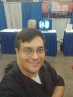
About 30 minutes before Lee Majors was scheduled to show up for signings, I made my way into line to wait. I was the third person there. He eventually showed up, not too late. The 2 ladies in front of me were drooling over the footage of the $6,000,000 man playing on the TV while we waited. Obviously, Majors' appearance here is coordinated with the release (finally) of the SIX MILLION DOLLAR MAN series on DVD in the U.S. for the very first time (legally). The only downside to this great news is that it's a $250 package from TimeLife and unavailable for rent or in individual seasons. You gotta buy them all or nothing. And no stores are allowed to carry them. So, a good news/bad news situation for fans.

Majors himself is in real good shape and seemed completely overwhelmed by this whole experience. The TV show predates the modern convention mania, so he was obviously quite outside of his comfort zone here. However, he was very friendly and nice. I shook his hand...TWICE! So sue me...he's the frackin' SIX MILLION DOLLAR MAN and I wanted to hold his hand a little bit!

I told him that I was an actual member of his "Fan Club." To which he laughed and said "I didn't know I still had one!" So, I smiled and told him about how when I was 9 years-old I clipped out the form from a comic and slipped10 thin dimes into an envelope and sent it in to join the official "Six Million Dollar Man Fan Club." But, a few weeks later, I received an envelope back with 9 dimes inside, my form, and a note that said I had only sent 9 dimes instead of 10. A very sad me was shocked and surprised and gloriously happy about a week or so later when the full Fan Club package arrived anyway! So, I walked away the first day with all my birthday money spent on autographed photos of Lee Majors, Lindsay Wagner, Richard Anderson and autographed prints from Mike Grell and Greg Horn. Like a friend of mine said...I was "like a kid in a candy store." All I know is that those 3 photos join my Johnathan Frid (Barnabas Collins) sign photo and my birthday sketch from George Perez as most prized possessions. Now I really need to finally get that Larry Hagman (J.R. Ewing) autographed photo.

After that, it was time to check in at my hotel room. Originally, I planned on heading back for the Bionic panel, but I realized I needed a little lay-down time. So, I relaxed at the hotel until about 5:30 and then started getting ready for dinner with some friends up from Louisiana. Chatting by text a few times during the day, I knew they were in town and we planned on meeting up for dinner. They wanted to know where and when, so I made a reservation real quick at MariaMaria Restaurant right off 6th Street. A great place for high-end Mexican food and drinks, plus it's co-owned by Carlos Santana. :) I figured more than enough time to meet up with my wife and daughter on the south end of Round Rock and skedaddle back to the downtown by 7.

I was wrong.

What I did not know or take into account was that this wasn't only the Comicon weekend. It was also "Play-offs" night at various high school football arenas, and it was the U.T. vs. O.S.U. game on Saturday, and it was a state teacher's conference meeting in the same location, and a friggin' movie was filming in downtown this weekend. Add all that to the normal afterwork traffic and our travel time tripled. :/ I kept sending my friends my apologies by text, and thankfully they went ahead and got the table and relaxed while they waited for us. Increasingly frustrated, we finally made it to where we normally would turn onto Colorado Street and damn if the road wasn't blocked off! So, takes forever to get around in Austin because of all the blasted one-way streets downtown. Finally make our way down to MariaMaria and the fracking $5 garage we always park in on the left is shut down. So, with no way to cross traffic back over to the right side....and to avoid Valet (because my OCD has a problem with valet parking), I drop my wife and daughter off and tell them to go in and find Jim and I'll be there as fast as I can. ..which, because of Austin's bassackwards road and traffic, took me way longer than it should, but I finally got parked in well-lit garage on the right and dashed inside and started scoping around for our table.

Great food. Great visit. A couple of hours later, around the time that the live music started kicking it up, we parted ways and I took my wife and daughter back to their car....which this time took all of 15 minutes rather than 1 1/2 hours. I headed back to my room close by the Con and made an early night of it so I could be bright-eyed and bushy-tailed in the morning for the mongo Saturday.


COMICON DAY 2
Woke and showered in plenty of time to catch the "Continental" breakfast at the hotel. First time ever that his included Mexican fried burritos and boiled eggs....but I'm not complaining. Booked it over to the Convention Center, no prob. Staying literally 3 minutes south (away from all the football madness) was genius. Met up with my sister and my son just as the doors were opening. Friday had been a steady but not overly large crowd. The Saturday crowd was monster sized already. In terms of space, this was not a particularly large space...easily about 1/4 of the size of the C2E2 for comparison. So, when this crowd descended on Saturday...well there were times during the day where I literally could not move because there was simply no space, just bodies. Of all the comics guys there, the top 3 in terms of continuous long lines were Greg Horn, Joe Madeiura, and Arthur Suydam. Suydam was the most popular (again, in terms of lines) with his massive Marvel Zombies banners and hundreds of zombie prints. Horn and Suydam were selling prints and books and were willing to sign with a purchase. Without a purchase, Horn was requesting a donation go into the Hero Initiative donation jar in exchange for sigs.

There was a huge emphasis on THE HUMAN CENTIPEDE at this Con. Which is bizarre to me. I don't get that appeal at all. But the guy and the two hot girls who star in that low-budget torture flick were there and the most disturbing thing I overheard as I walked by was a guy holding his signed picture from one of the girls and telling her he loved the movie. *shudder* How anyone loves a movie where that girl gets her mouth surgically attached to a guy's butt is beyond my comprehension. Had no interest in Xander from BUFFY. But he was there.

One thing I noticed immediately upon entering the Con was a deep fixation on the camera I wore around my neck. It was kind of crazy. Every time I moseyed anywhere within sight line of a celebrity...if I even glanced their way I would be staring eye-to-eye by someone with badge either shaking their head at me or actually putting their hand up and saying "No pictures." Except for poor Ernie Hudson of GHOSTBUSTERS fame. He was there wearing his full Ghostbusters costume and set up right next to a replica of their Ghostbusters-mobile. Nobody seemed to mind when I stood back and took a string of pictures of Ernie. But whatever you do, don't try to snap a pic of Peter Mayhew or Gil Gerard. Try to take a picture of Billy Dee Williams or Lee Majors and I got the distinct impression that my children might become orphans. This kind of thing eventually started pissing me off...because I really don't like people treating me like that and I get kind of immature. So, yeh. After awhile, I turned off my flash and started just nonchalantly snapping pics without aiming as I walked through the aisles. Wound up accidentally catching folks like Claudia Christian, Lou Ferrigno, Kevin Nash, Joan Severance in some of them. Oh well, let's all remember the WizardWorld sign outside at the entrance says:

"By entering these premises you consent to be photographed, filmed and/or otherwise recorded for any use and waive all rights you may have to any claims for payment or royalties in connection with any exhibition, televising, or other publication of these materials." [emphasis mine]

Roaming around in the crushing crowd, I periodically popped by the Artist's Alley to see if a few of the guys I was interested in talking to (like Matt Sturges) were available, but crowds everywhere. Eventually I gave up and decided to hit them all up on Sunday when I was sure that the crowd would be much smaller. I overheard a lot throughout the day as I went in and out of the pathways of celebs, comics pros, and dealers. The most obvious constant was that they were without exception very very happy with the response in Austin.

My son spent a lot of time at a dealer in knives, swords, and stun guns. I will say that the telescoping light-sabre-style massive stun gun was definitely impressive. You could hear those things going off all day as the dealer was demonstrating her wares. She always had a full contingent of men checking out the weaponry.

Claudia Christian bumped into me on what I believe was a quick dash to the restroom and when I turned back around, there were some friends I was supposed to meet up with for lunch. So, the three of us grabbed my son and headed outside to look for a place to eat. I wasn't exactly sure what all was in the area, so we just started walking. Sidewalk was a little busy, so we slipped into the mostly empty bike lane for a block or so. That was a mistake. I forgot that the Austin bike community is a militant wing having delcared a fatwa upon all pedestrians and drivers. We weren't there 5 seconds and an obnoxious biker...with more than enough room...yells "BIKE LANE!" at us. We ignored her. But we got a good amount of daggers flung our way from bikers' eyes during that short walk across the street. *sheesh*

After a good lunch at the Spaghetti Warehouse, we headed back to the Con. Walked around some more with my boy and then he headed back to the stunguns, so I left him alone and felt the need to visit the restroom myself. What I found in there is difficult to describe, but besides the enormous line of geeks waiting to use the various holes, the place looked like a bunch of angry chimpanzees had had a poo party or something. So, I tried the other restroom. It too was a disaster, and now it was becoming urgent. Then I remembered the Teacher's Conference upstairs..."teachers are less likely to conduct themselves like angry chimps" and hopped on the escalator and snuck into the restroom up there. Clean, quiet, victory.

Rushed back downstairs to meet up with my son to sit in on the Walter Koenig panel. Took note of the sign at the entrance to the Exhibit Hall with two stages set up. The sign said "Photos allowed in Exhibit Hall while celebrities are on-stage as long as photos are for personal use only." Woohoo! So, I happily snapped away with my phone as ol' Walter talked. I'm not kidding when I say that he was asked TWICE to say "Nuclear Wessel" in 30 minutes. If he was Del Shannon, he would've killed himself on the spot.

After Walter's talk, it was time for my son to decide how he wanted to spend his $20. Out of everything he walked around to look at, it came down to a decision between 2 items: A butterfly knife from the stungun lady or a signed soup ladle from the "Soup Nazi" from SEINFELD. The "Soup Nazi" won the prize...and my son is incredibly happy and thrilled. "Soup Nazi" was so nice, visited with us, and let us take pictures with him. At one point as he was signing the ladle, I told him "that must've taken some practice." To which he smiled up at me and said "You'd think so. But the weird thing is that the very first time I tried it, it came out perfect. I guess I was born to sign soup ladles!" And he laughed. That was the end of the day for my boy. Once I got him dropped off with his mom, I was back inside for Bill Sienkiewicz's panel. Snapped a couple of shots of him just with my phone. Good sized crowd. Immediately after that was the Adam West & Burt Ward panel on the other stage.

Crowd was pretty huge, so I went off to roam again for awhile. When I checked the time and realized the West & Ward thing was 15 minutes into it, I strolled back in and stood way in the back to listen in and snap a couple of grainy zoomed-in photos. By the time I snapped the second picture I was being manhandled by this long-haired dude (too old to keep his hair that long unless he's a member of an '80s hair band). He was in my face about how he told me "4 times from the stage that there were no photos allowed!" To which I informed him that I just walked in and didn't hear that announcement and... he interrupted that we needed to let security deal with me. And I, again politely but firmly, pointed out to him that I obviously understood there was a policy against photos out on the floor because of the paid photo ops (I'm not a moron) but that the sign at the entrance to the panels says that photos ARE allowed while the guests are onstage...for personal use. He smirked and mockingly said "really...show me the sign." I said.."Okay. Unless someone has taken it down or something." Which got me a superior snort from him. So, I walked him to the entrance and pointed out the sign triumphantly. His puffed up chest deflated as he read the sign and he didn't outright apologize, but he told me that I could keep the picture I took. I accepted that as an apology. Then he hustled off to get that sign taken down because, according to him, it was "not supposed to be there." Pissed me off, but there was a sense of satisfaction in that I was right this time. But thank you long-haired Whitesnake reject for ruining the West & Ward panel for me. I had no interest in walking back in there after that. Basically, the Con organizers and their bullies need to lighten the hell up on the quick-snap photos or they need to just outright ban cameras entirely from the event.

In fact, I kind of needed to just get out for awhile at that point and went and grabbed some dinner. Headed back for the Costume Contest after some food, which was a lot of fun. Lasted over 2 hours and a guy dressed as Mario actually won. He was funny and good...but Power Girl, Blue Falcon, Martian Manhunter, and Hawkgirl were all much better and all deserved Best In Show...in this humble reviewer's opinion. Honorable Mention should go to "Pimp" Vader.

     
Headed in to the last hour of the GHOSTBUSTERS screening and afterwards visited outside for about another hour with the drop-dead gorgeous cos-play model "Taffeta Darling" and Scott from busygamer.com. I then headed to Sixth Street where I thought I might pop in to the costume after party at the Gypsy Lounge until I realized it was waaaayyyy down on the east end of Sixth Street. I no go there. Sorry. Soaked up the Sixth Street scene for a bit. Grabbed something to eat while reading a HOUSE OF MYSTERY trade and it was about 1 a.m. and time for bed. Relaxed and streamed the pilot of THE WALKING DEAD before heading to sleep.


Wednesday, November 3, 2010

SUPERMAN: EARTH ONE...a disappointing almost-classic

SUPERMAN: EARTH ONE

Writer: J. Michael Straczynski
Artists: Shane Davis (pencils) & Sandra Hope (inks)
Publisher: DC Comics

"So what do you think about this super-guy?"
-- unnamed Arctic researcher

This is going to be a long review, so I apologize up front for that. But I think the degree of press attention for the first in DC's new line of EARTH ONE books justifies a lengthy examination.

I appreciate what DC is attempting here, but I wound up ultimately feeling dissatisfied by the end. The mythically iconic nature of Superman's origin story is such that I never tire of reading different versions of it. I do tire of retellings of Batman's origin, Spidey's origin, etc. As a general rule, just note the origin and get on with a more interesting story. The INCREDIBLE HULK movie did the origin perfectly... quick flashes of images that give the viewer all he needs to be up to speed and then jump into the story. Superman, however, touches that messianic aspect within that makes it eternally ripe for reinterpretation. So with hesitancy, but also anticipation, I dove into SUPERMAN: EARTH ONE and there are parts I liked a lot but rather than build enthusiasm as I read it, I eventually reached a point where I felt I was simply plodding through to a thunderous clunk at the end.

Don't get me wrong. It's a beautifully produced book. I love the printed hardback cover (rather than a slipcover). It looks and feels substantial in your hands. For $20, you want to at least feel like you're getting your money's worth.

And like I said, I appreciate the attempt here to reinterpret the Superman concept for the modern, and presumably, more current youthful market. The news coverage of the event has been stupidly fixating on the "hoodie" that the brooding 20 year-old Clark Kent wears on the cover, much like the news media missing the point of the WONDER WOMAN reboot by hyper-fixating on her costume change. As such, the media misses the bigger picture. First though, let me first lay out those elements that did work for me.

The degree of thought that went into this work is impressive. Straczynski removed nearly every shackle of DC continuity from Superman and approached much like a new concept within the "real", or rather a more "realistic," world. This is not the "Earth Prime" of DC continuity. The concept of "Earth Prime" was that it was "our" world...that is...a world without "Metropolis", "Gotham City", "Star City", etc. "Earth Prime" was our world in that the DC characters existed there, but in comics only. This new line of EARTH ONE comics is not the same concept. This is "our" world only in the sense that it is mundane and recognizable. On "Earth One," the fictional cities of DC exist and the characters do not already preexist in the comic books of that world. So, it's not "our" world. In "our" world, people would have instantly recognized Clark as a "super-hero." But in the EARTH ONE series, not only is he the last son of Krypton...at this point...he is the only one of his kind. He is something truly new.

I liked Straczynski's characterization of Clark throughout the entire book. He's a young man striving to determine his purpose in life. I liked how Straczynski extrapolated the impact of these types of powers upon a young man of good character in this modern day. In a sense, the first part of the book plays out a lot of details quite similar to the classic novel GLADIATOR, by Philip Wylie, which was an inspiration for the Superman character originally. Clark, in this well-thought out concept, basically has his pick of anything he wants to do. He can sign with any major sports organization because of his physical abilities or he can write his own ticket in the science field because of his heightened mind and information processing. So, why does he choose a daily newspaper in 2010 when the newspaper industry is struggling for relevancy in the digital age? And why does a major metropolitan newspaper decide to hire a 20 year-old with barely a 2-year degree from community college? Straczynski sets it up fairly well. Not totally believable, but it kinda works for the apparent necessity of inserting the iconic elements into Superman's origin.

I appreciated the utter absence of any sense of a Lex Luthor or a Brainiac or a Zod. My geek side may love these characters, and truthfully, Lex Luthor particularly is one of the great villains of literature...who has rarely had a great story utilizing him. But for this EARTH ONE type of project to work, it has to establish Superman in this "realistic" world first...and there's no need to tie his feet to the continuity cement blocks before he's even gotten out of the gate.

I appreciated Straczynski's decision to focus on the conflict that gives rise to Earth's first super-powered champion and to make the outside conflict an extra-terrestrial assault. One thing Straczynski does well is set-up under layers of conflict that give a sense of a larger story at work. In this case, the main focus is clearly on the inner workings of a young man struggling to embrace his destiny against the temptation to just make a lot of money and make sure his widowed mother never has to worry about anything. At the same time, the larger conflict brewing out there is that Clark is also the target of an intergalactic hunt to track down and destroy the last Kryptonian by Krypton's bitter enemies.

The details of these conflicts were all very fascinating and well-thought out...but yet...by the end I felt dissatisfied. It was actually around the point where Clark finally put on the suit and took on the alien assault that the book started to lose steam. At the point where it should be at its most exciting, I was losing interest. I couldn't tell whether it was the pacing, the dialogue, the art, or what...but I went from thinking this was surprisingly good to the point where I cringed almost when Clark put on his sloppy, low-waisted pants, suit with a tie and popped on the glasses.

I realized, ultimately, that it was the forced introduction of the familiar that intruded upon my enjoyment. So much of the first half of the book felt new and "real" that as each of the more familiar aspects of the concept appeared, the flow was interrupted with the recognition of what was happening. What I realized was that, like the frustration of reading a book that violates its own internal logic with a deus ex machina resolution, this story worked within its own logic up until it started adding back in those elements outside its own "realistic" logic. Would that Straczynski had been afforded an opportunity to fully extrapolate the basic Superman/Clark Kent dynamic into something completely new, I think this would be more substantial than just a best-selling piece of eye candy.

Which brings me to the art. How do I put this? Buried somewhere beneath the stiff bodies, stone faces, gnarled hands, and light-boxed Google photos of "Debra Morgan" from DEXTER is a good artist trying to pull himself up and out like a zombie clawing itself out of the grave. The tracing and swiping is hamstringing Davis's ability to tell this story in a truly effective way. Compare his lack of drama (because his panel compositions are limited to fit the photos he Googled) to John Bolton's uses of photo referencing in THE GREEN WOMAN (which I reviewed last week). It's an astounding gap between the two and it's more than just years of experience.

All artists, myself included, are guilty of some degree of tracing and swiping. In fact, the first "cartooning" I did back in elementary school was using carbon paper to trace RICHIE RICH and SPIDER-MAN covers. And a lot of what I produced in my teen years was built from tracing or copying my favorite artists, which actually taught me quite a bit about basic drawing techniques. Hell, as a 17 year-old, I all but redrew a bunch of Bernie Wrightson panels for a school project. I'm not proud of it, but that's the idiocy of youth there. Transitioning into a commercial illustrator, however, a person has to move beyond that and into your own. In a professional job like this one, Davis is flat-out guilty of artistic plagiarism, at least in his use of the "Debra Morgan" photos, but I suspect now throughout the book. Immediately noticing the tracing made me start fixating on every other character in the book and wondering about the photo references. As a result, I started seeing faces that might be Brad Pitt, Robert Downey Jr., and maybe even Christian Bale as Clark? I'm not sure. But the Lois reference isn't even disputable because it's an outright trace much of the time. In contrast, Gary Frank's version of Superman is a fine example of how to take a real person and use them as the basis for your character without tracing photos of that person.

I've noticed a tendency in younger artists in the Google age to rely on tracing rather than develop their own style. And in an artist like Davis, this does a disservice not only to the project but also to his own development as an artist. He obviously has raw talent because the details that he adds and his landscapes, alien designs, and his ability to copy as well as he does all demonstrate that he has the skill if he stops leaning on the photo crutch. He is clearly weak when handling the human form, the human hand, or how the body moves in any real sense and this creates that stiffness throughout the book. Working slavishly off of posed photographs will diminish any sense of movement that an artist is trying to evoke. It's the difference between photo as reference and photo as crutch. The experienced artist takes the photo and uses it to give himself an "action" line for his character, then he builds up from the action line with the basic skeletal framework for the form. Then he draws his character from his own action line and framework...NOT FROM THE PHOTOGRAPH. It's the same type of thing I deal with when I am teaching basic research and writing. To avoid a charge of plagiarism, when researching facts, take bullet point notes (not complete sentences) on a separate sheet of paper and then write your paragraph or paper from your notes and not from the original source. This way you are creating your own work and not stealing someone else's work.

Davis's blatant tracing here is akin to a writing student I once had, one of only two I've ever had to fail. She was actually one of the strongest natural writers I've taught, but the final research project counted for 50% of her grade and I never allow make-ups for the Finals. She had 3 solid weeks to work on it. When I sat down to grade it, I noted that the project was formatted beautifully, structured correctly, and was reading quite well...and then I caught a glitch. In the middle of a well-written paragraph there was a "page number"...the type of "page number" that Westlaw inserts in their digitized Case law so that a researcher can properly cite the page number for the physically printed version of the case. She had missed it or forgotten to delete it before she turned it in. So, I pulled up the case on Westlaw and found the page number and yes, she literally cut-and-pasted paragraph after paragraph. Without spending the rest of my night trying to distinguish between which parts of the project she wrote on her own and which parts were plagiarized, I had to give a zero on content.

Unfortunately, turning a critical eye towards this project, Davis's artwork in SUPERMAN: EARTH ONE winds up getting a zero from me as well because I honestly can't tell what all he traced and what all is his own work. Had he sketched from the photos first and then worked from the sketches, there would be similarities to the photos but they would not be blatant tracing.

Sandra Hope, on the other hand, lays down gorgeous inks and texturing to Davis's art. For my money, the gorgeous look of the art overall is grounded more in Hope's inks and Barbara Ciardo's beautifully rich but slightly desaturated colors. Hope particularly brings confidence to the line-work and demonstrates once again why she is one of the finest of the current crop of inkers. Digital rendering is leading to a reduction of opportunities for professional inkers, but I am very happy that DC chose to bring her in on this book rather than work directly from Davis's pencils.

I really admire what was attempted here. And it is not a failure. In fact, I suspect most people will enjoy it and never dig any deeper critically...and that's fine. We all approach our art and literature with differing needs and expectations. I, however, found SUPERMAN: EARTH ONE at times excellent, at others stilted and dull, and overall a disappointing almost classic.

Tuesday, August 31, 2010

Spotlight on "Ghosts"

SPOTLIGHT ON "GHOSTS"

To me, one of those funny things about the publishing media is the "ghost writer." I understand the thinking behind it. Famous people (politicians, actors, nuts, etc.) can sell books simply by putting their names on it. So, the publishers toss money to the celebrity for their name, and then hire someone else to write the books. For whatever reason, everyone else thinks it's just a wink-wink-nod-nod type of thing that doesn't matter. However, I've actually been in the position of "ghost writer" on some things in the past, and while I knew what I was doing, it has always bothered me that someone else gets to claim credit for the work I did. I'm also just cynical enough at this point to never believe any politician or celebrity ever writes their own books. I am, however, willing to at least give due to the "autobiographical" books in that I honestly think those books are usually more of a collaboration between the celebrity and the author. Heh. Although even then, there are exceptions. When Hillary Clinton supposedly wrote her life story, I remember a TV interview where she couldn't "remember" things she had "said" in her own book. But can I just say that my road to cynicism began when I discovered that John F. Kennedy's Pulitzer Prize winning book PROFILES IN COURAGE had actually been written by Theodore Sorenson. To me, that's just outright lying to claim authorship of something you didn't write...and especially something as profoundly resonant as that book. Then, to discover over my life how many books I thought were authored by one person were actually written by someone else. For example, who wrote STAR WARS? George Lucas? Well, that's what it says on every edition I've ever seen of the novel STAR WARS (actually originally subtitled FROM THE ADVENTURES OF LUKE SKYWALKER). But no, it was written by Alan Dean Foster.

Anyway, over the years of my disgust, I've gotten to where I play a little game whenever I walk in a bookstore and see a new novel "written" by a celebrity. The game is: FIND THE REAL AUTHOR. In recent years, it has become a bit easier because the less egotistical of the celebrities will allow the ghost writer(s) to share credit on the cover (i.e., William Shatner with Judith & Garfield Reeves-Stevens). But it is still a rampant practice to hog all the credit for the celebrity when he (or she) probably never wrote one word. That's where the game comes in. Digging through the always lengthy acknowledgements requires some skill to sift and shake until the true author's name finally pops up.
This first installment is for Mr. Glenn Beck's new novel THE OVERTON WINDOW, a political thriller, from the massively popular but also incredibly irritating radio host. Well, let's see....digging through Beck's b.s. takes us to special thanks to first his Viewers, Listeners, and his "Insiders" (who I guess are people who actually pay money to the idiot to get even more garbage from him than his radio show, tv show, and free web presence). Then he declares that they are not racists. What? Then he thanks his poor, unfortunate wife, kids, and some other radio folk. Ah, now he gets to thanking his editor and staff at his publisher Simon and Shuster. That's good...but still no clue as to the actual writer. Did Beck actually write his own novel? No way. Let's turn the page on his incessant acknowledgements...
Page 2. Ugh. Now he's thanking the people that syndicate his radio show and then praising Fox News Network. Blah blah blah. Then a bunch more thanks listing people but not singling one out. What? This can't be right. Let me go back to page 1 and check again....ah. Hahaha. There it is. I actually missed it on first scan. Here it is. One sentence between his family and the editor, he writes: "JACK HENDERSON for pouring his heart and soul into this project. And to Jack's wife, LORI, for letting him."

The nebulous thanks is always the true author. Usually it says something more along the lines of "Without whom this project would never have happened..." or "I couldn't have done it without you..." That sort of thing.

So...hats off to ghost JACK HENDERSON, author of THE OVERTON WINDOW. Hope you get your due in attention and money for this sure to be an instant best-seller.

------------------------------------------

My new resume' for your perusal and consideration. Thank you.