
Tuesday, November 29, 2011

Tuesday, November 22, 2011

Sunday, November 20, 2011
Ray Bradbury: Story of a Writer
RAY BRADBURY: STORY OF A WRITER
This 1/2 hour film is from 1963 and was originally aired on television. It is a biographical sketch of the author, Ray Bradbury and I was shown this back in 7th grade at Travis Middle School in Temple, Texas. I still remember it vividly. The 16mm film click-clacking and the projection light flickering as the teacher (perhaps somewhat unwittingly) completely captured my attention and imagination. At that point, I had never heard of Bradbury and was not much in the way of a reader of science-fiction.
Within this film, Bradbury creates a brand-new short-story called "Dial Double-Zero" and it is dramatized as Bradbury reads it. The story completely creeped me out and I became fascinated by the imagination of Ray Bradbury. The next Saturday, I took my first trip to the Temple Public Library and wound my way to the card catalog to look up "Ray Bradbury." I tracked down the rather small "Science-Fiction" section of the library (a small room set apart from the "real" books) and found "The Martian Chronicles" and checked it out.
This began a life-long devotion to reading and enjoying science-fiction. This little film that easily bored most everyone else in my class but reached inside my head and heart and took hold of me.
For decades, I have tried to track down the story "Dial Double-Zero" and been frustrated. No matter where I went, I could find no record of the story ever existing. I even came to sometimes doubt my own memory about every seeing the film or hearing the story. I've often looked on the Internet for clues over the last 15-20 years and always come up short...until today.
I decided to give it another try as more and more information wings its way onto the web...and voila. I have found it! I did not have a false memory after all. Not only was the film and the story real, there was a reason all these years that I could never find the story referenced anywhere: "Dial Double-Zero" remains an unpublished story by Ray Bradbury.
So, if you want to read the story (and I highly recommend it), then you have to watch this video. I am embedding it here where you can just stream it, but you can also visit this website to freely download a digital copy (legally) for your own use or to burn your own personal DVD of this historical piece of television and literary history.
Wednesday, November 16, 2011
FLASH GORDON and CAPT. VICTORY Reviews!

FLASH GORDON: INVASION OF THE RED SWORD
#6
Writer: Brendan Deneen
Artist: Eduardo Garcia
Publisher: Ardden Entertainment
“So....Hans...when we met at that
boring dinner after the Olympics, did you ever think we'd end up like
this?!” -- Flash Gordon
A rousing conclusion to a great story.
I've raved about Ardden's FLASH GORDON series every chance I get and
the conclusion to this mini-series is perfect. I don't want to give
anything away but all the pieces come together in a very satisfying
wrap-up (and like all good serials...a tease about an obvious future
development). If I understand correctly, the next FLASH GORDON
series from Ardden is not going to be a monthly pamphlet-style but a
complete story in one larger graphic novel format.
I understand the market needs that make
that the more viable way to get the story out there, but I will miss
the serialized aspect of the monthly series. One of the hallmarks of
this and the previous mini-series have been the masterful pacing and
cliffhanger-style storytelling.
I can't really dig into it much deeper
other than to say that I love the way writer Brendan Deneen writes
the characters. They are recognizable as Flash and his supporting
cast but they feel modern and relevant. The story is fun but also
nuanced with moments given to characterization. Artist Eduardo
Garcia stepped in with this story and has grown with each issue. He
gets better and better. A fine artist with a good sense of how to
tell the story in pictures.
Recommended for all ages.
STAR TREK/LEGION OF SUPER-HEROES - A Recipe for Fun

Writer: Chris Roberson
Artists: Jeffrey Moy (pencils) & Philip Moy (inks)
Publisher: IDW Publishing
===========================================
Ingredients:
1 Cup – Original Starship Enterprise crew (circa the end of the second season)
1 Cup – Legion of Super-Heroes (circa post-Great Darkness Saga)
1/2 Cup – Tommy Tomorrow and the Space Rangers
1/3 Cup – Borg
1/4 Cup – Khunds
2 Teaspoons – Klingons
Pour all ingredients (except the Original Enterprise crew and Legion of Super-Heroes) into a large mixing bowl. Amalgamize cross-dimensionally and mix in basic time-travel tropes.
Let sit until firm. Once you have built enough anticipation, add in the Enterprise crew and the Legion of Super-Heroes and a dash of cliffhanger and you have one of the most fun comic-book reading experiences an aging fanboy can have.
===========================================================================
I'm not sure at all how younger readers might respond to this, but I can't imagine anyone who grew up with the old STAR TREK and was reading comics during “The Great Darkness Saga” could have any complaints here. This is just plain balls-to-the-wall fun and adventure.
It's a step down from the Phil Jimenez cover art, but it is consistent, clear, and fun with a real sense that they are enjoying telling this story in pictures. When I get a sense of that from the art, it is infectious and makes me enjoy it all the more.
I don't want to spoil too many details, but the scenario for drawing these two properties together totally makes sense and offers us a glimpse of an amalgamized universe where the continuities of the old DCU and the old TREK universe existed together and splintered off into a very different 23rd Century. The first 2 issues of this 4-issue mini-series served to establish the mystery of how and why these 2 crews showed up in this alternate universe at the same time. And we get our pay-off for our patience at the end...but then we have to wait for the next issue to see what happens!
I will offer my guess that the unidentified “Emperor” of the Imperial Planets is not Spock (as I suspect they are trying to give that hint) but actually...Vandal Savage.
We will see very soon. Great stuff.

BIONIC MAN #4 Review

Writer: Kevin Smith w/Phil Hester
Artist: Jonathan Lau (pencils) & Ivan Nunes (colors)
Publisher: Dynamite
“Colonel Steve Austin, a man barely alive. Gentlemen, we can rebuild him. We have the technology. We're going to recreate the world's first, fully functional Bionic Man. Stever Austin will be that man. We'll make him better than he was before. Better, stronger, faster.” -- Oscar Goldman
I've met Col. Steve Austin...and you, sir, are no Col. Steve Austin.

If you were a kid with a television in the 1970s, you watched it. If you're younger than 30, you probably only know it by reputation because the character and the basics of the premise (along with slo-mo running and neh-neh-neh-neh sound f/x) are a pop-culture touchstone now.
And now, at 45, I sit here trying to read a horrible attempt at updating the character for the modern day. However, this issue is at least a bit more readable than the previous 3 issues, mainly because it's essentially just the surgery, recovery, and training to control his bionics. It ends with Steve agreeing to join the OSS and take down villains like Bin Laden and Qadafi. So, I guess I'd have to say that if you haven't picked up the previous 3 issues, this is the place to jump on because they were all such inconsequential nonsense and gloriously bad that I can't in good conscience recommend them. But, even saying that, I don't mean to give the impression that this issue was good. Far from it. It's also pretty stupid. I can see where some of the elements in play were hashed out in terms of plot, it's just that the way the storytelling progresses, plus the stilted dialogue, is about as bad as some of those 50s' B-monster movies...but with pointless cursing added.
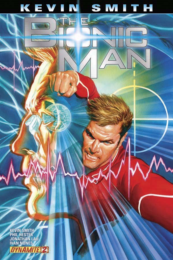 Beyond the fact that it just kind of stinks overall, I'm amused by the things that distracted me (always a bad sign in terms of quality of writing or art). For example, I am just assuming that part of the license Dynamite has here requires them to avoid the likenesses of the actors from the TV series. And that's fine. However, was it really necessary for them to “cast” Wilford Brimley in the role of Dr. Rudy Wells? And to add to the confusion in terms of comic book casting, the covers (especially issue #2) realllllly make Steve look a whole damn lot like Lee Majors, whereas in the comic he's a generic steroided out mushed-nose tough guy. More confusing is the appearance inside the comic of the actor, Richard Anderson (Oscar Goldman in the TV series) in a couple of scenes as one of the surgeons. This was especially confusing at one point where, in another example of bad storytelling, it appeared that he might actually be “Oscar Goldman." I had to flip back a couple of pages to figure out what I was looking at.
It's just inconsistent and odd decisions to make when doing the comic.
During the surgery, there's a lot of scientific jargonage tossed around by Oscar in an attempt to lend some degree of believability to the plot. So, if you want to read 4 pages of exposition, this is the book for you. Thankfully there's no follow up in this issue to the plot that kicked off the first issue (the one with the bionic bad guy slicing people's heads in half with a samurai sword....yeh...that's what I said). It's basically a stand-alone comic that's a glorified training montage.

They completely skipped over the emotional struggle of Steve coming to terms with what happened to him. This was a strong part of the original TV-pilot movie and the novel the show was based on, CYBORG by Martin Caidin. And that's the worst thing about this series so far. There's no passion or emotional connection to the characters.
At least Max, the bionic dog, makes a short appearance at the beginning to somehow convince this man who woke up to find himself with 1 eye, 1 arm, and no legs to submit to experimental surgery that will wind up also removing his good arm and his 1 good eye as well. Yes, they did that to him. But don't worry. He frets about it for 3 or 4 panels and then....it's all good.
Thursday, November 10, 2011

Monday, November 7, 2011
when the world screamed: Cutting Through the Nonsense with Common Sense
I've started a second blog for writings that are less sarcastic and fixated on super-heroes and the silly stuff in life. I call this one..."when the world screamed: Cutting Through the Nonsense with Common Sense." Here's a sneak-peak at my first entry dealing with the Texas Education Fund and the nonsense surrounding that. Check it out, if it interests you, follow the link over to the full entry and see what you think. If you would connect and follow that blog too, that would be cool. I got the name from the last of the "Prof. Challenger" stories by A.C. Doyle. It's a title I've always wanted to steal for something.
Hijacking Texas Education Funds Through the Guise of "Privatization"
 News reports have been hammering our brains for the last year or so about how Texas must cut 3-to-5 Billion (with a capital “B”) dollars from “Education.” Of course, there's rarely any specifics about where these cuts are made. The cuts are just made and then left to the agencies and school districts to figure out how to deal with it.
 You may wonder who that is? According to Abby Rapoport in The Texas Observer, “Pearson is a London-based mega-corporation that owns everything from the Financial Times to Penguin Books, and also dominates the business of educating American children.”
 That is privatization.
Hijacking Texas Education Funds Through the Guise of "Privatization"
 News reports have been hammering our brains for the last year or so about how Texas must cut 3-to-5 Billion (with a capital “B”) dollars from “Education.” Of course, there's rarely any specifics about where these cuts are made. The cuts are just made and then left to the agencies and school districts to figure out how to deal with it.
At the same time that this budgeting fiasco has been going on, Texas has gone through some highly public battles with the school board over textbook rewrites and the state embarked on a major overhaul of their standardized testing system. So, out with the TAKS and in with the “more rigorous” STAAR and EOC (End-Of-Course) Examination system. As well, add in the massive spending involved in an attempt to set up a state-wide online curriculum and testing system. Through it all, one name keeps popping up: Pearson Education.
You may wonder who that is? According to Abby Rapoport in The Texas Observer, “Pearson is a London-based mega-corporation that owns everything from the Financial Times to Penguin Books, and also dominates the business of educating American children.”
In fact, The Texas Observer did an outstanding job of laying out some of the details and reasons why Texas taxpayers (and basically anyone in other states where Pearson is found) should be alarmed at their lobbying efforts. I recommend everybody read the article in full. My conclusion is that the people's call for “privatizing” the school system seems to have been misconstrued intentionally into a massive intertwining of government funds (meaning: TAXPAYER DOLLARS) with a massive FOR-PROFIT CORPORATION in a way that could only make Halliburton smile with understanding.
Calls for privatizing the education system are rarely demands to funnel tax money into the coffers of private corporations. Calls for privatization are calls to remove government from the system, thus returning all tax monies to the individual citizens, and allowing the free market to function. The individual citizens decide to whom and where to funnel the money...or not.
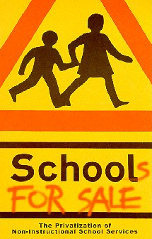 That is privatization.
What the Texas Education Agency, Texas legislators, and the hundreds of for-profit corporations, like Pearson, are doing is a bastardization of the concept mostly done on the down-low while everyone in the media is distracted by the ridiculous nit-picky backbiting at the State Board of Education over what goes in and out of Texas textbooks.
You might ask why would I pick on Pearson so strongly. Is it just because The Texas Observer says I should?
Well, I did some digging just to see where our tax money was actually going in terms of “Education” and specifically in regards to Pearson. This was accomplished by visiting texastransparency.org which bills itself with this sub-line: “Open government is accountable government: a clear look at your tax dollars at work in Texas.” Unfortunately, it may be “clear,” but it most definitely is not easy to maneuver. They have the site rigged up in such a way that the information is there but in terms of ease of access – frustrating. The drop-down stair-step approach to the searches and the slow searching script and the unavailability of multiple searching within one session make it very difficult to get a straight and “clear” set of numbers. The numbers don't necessarily always quite add up either. Let me explain...
Click here to read the rest...
Sunday, November 6, 2011

Monday, October 31, 2011
Prof. Challenger Official Portrait

I finally got my official portrait for the 'Hole's Clubhouse over @ AICN Comics. Who knew it takes over 5 years just for the frame?
Wednesday, October 19, 2011

Friday, October 14, 2011
POLL! Best TV Villain Ever!

Make Your "Otaku-Sophie's Choice" today!
The BEST TV Villain ever is one of these four...
Michael Dunn as DR. MIGUELITO LOVELESS (Wild Wild West)
Larry Hagman as J.R. EWING (Dallas)
Joseph Mascolo as STEFANO DIMERA (Days of Our Lives) or...
Frank Gorshin as THE RIDDLER (Batman)
POLL! Worst TV Villain Ever

Make Your "Otaku-Sophie's Choice" today!
The worst TV Villain ever is either...
Art Carney as THE ARCHER (Batman) or...
Michael Pataki as COUNT MALACHE (Happy Days)
Thursday, October 13, 2011
C-O-E-X-I-S-T Comic Book Style!

to Order Your Very Own from my CafePress store for $3.99 or 10 for $29.99
A great treat for you to give to your most special Trick-Or-Treaters this year!
Tired of the usual stuff. Sick of the pomposity of the various "COEXIST" Bumper Stickers.
Show the world where the harshest conflicts are fought -- the world of Comic Book Geek-dom. Are you a Marvel zombie? A DC guy? How about a Charlton nut?
Tell the world that it's time for everyone to just get along.
My COEXIST bumper stickers are perfect for expressing yourself while cruising down the highway or just for posting on the wall, your neighbor's dog, or even you toilet.
- Measures 10" x 3"
- Printed on 4mil vinyl using water and UV resistant inks - means no fading in the sun or bleeding in the rain. So take THAT faded "Darwin Fish" people!!!
Wednesday, October 12, 2011
Dark Shadows Cast Photo w/Johnny Depp as Barnabas

Entertainment Weekly has published the first official cast photograph from the new Dark Shadows feature film, which is seen above. From left to right: Helena Bonham Carter (Dr. Julia Hoffman), Chloe Moretz (Carolyn Stoddard), Eva Green (Angelique Bouchard), Gulliver McGrath (David Collins), Bella Heathcote (Victoria Winters), Johnny Depp (Barnabas Collins), Ray Shirley (Mrs Johnson), Jackie Earle Haley (Willie Loomis), Jonny Lee Miller (Roger Collins) and Michelle Pfeiffer (Elizabeth Collins Stoddard).
Tuesday, October 11, 2011
HAPPY HALLOWEEN with THE GENERAL MILLS MASSACRE
 |
| GENERAL MILLS MASSACRE! Count Chocula, Frankenberry, and Boo Berry Like You've Never Wanted to See Them! |

Horror maestro Steve Niles takes on an unlikely band of 'cereal killers' from his youth. And it's not what you think...Whether he cooks up ghastly zombie tales (Wake the Dead) or vicious vampire titles (such as the chilling 30 Days of Night, currently in production as a feature film from Sam Raimi), Niles has proven himself as comics' foremost expert when it comes to scaring the hell out of readers. But his next project will prove he's a creator who thinks outside the cereal box.
Steve Niles' next project may curdle your blood and your milk...
Niles and new publisher AFD Press have obtained the license to General Mills' most popular ghouls -- Count Chocula, Frankenberry and Boo Berry -- and will feature them in an edgy title, a four-issue mini-series titled General Mills Massacre that premiers in October with art by Shiver in the Dark's Stuart Sayger. Niles hopes to redefine undead icons packed with eight essential vitamins.
"Just because they got their birth on a cereal box doesn't mean they aren't great characters," says Niles. "Especially Frankenberry. He has a sad quality that reminds me of [Robert] DeNiro as the creature. There will have to be certain changes made. I imagine Stuart will go for a sickly pink skin tone, but General Mills has made it clear that each character, even brought to life, should reflect their flavor. I may never get to work with the Universal Monsters, so for me, this is very exciting."
It's not surprising AFD Press was able to pick up the license, as General Mills has been more open to lending out their creations of late -- handing over Count Chocula, most recently, to MasterCard for a Super Bowl commercial.
Still, where humor may be easy to pull off, how will Niles provide these loveable characters with two scoops of terror?
"Actually, the easy part was making these cheery characters gruesome and unsettling for the reader," Niles says. "I'm tapping into childhood fear at its most basic level. Think about circus clowns--they're meant to be funny, but most people get unintentionally sick with fear just looking at them. It's that mentality I'm going for. We've come up with a great gag switching out blood for milk in issue #2, and you'll see what I mean. It's like that scene in 'Lost Boys,' when Jason Patric thinks he's eating rice, and, well...it will put you off breakfast for a while."
Niles has license to re-work the character origins and will introduce an old favorite in the second issue.
"Oh yes, Fruit Brute will make an appearance," he says, referring to General Mills' little-known werewolf character of the early 1970s. "There's a petition going around to include Yummy Mummy [Editor's note: another cereal-based character], but I think he might be too obscure to work into this story arc. We'll see."
One thing seems certain: Once fans are exposed to the darker side of Boo Berry, prize-seekers will think twice before sticking their hand into the open maw of a cereal box.
Thursday, October 6, 2011

Tuesday, October 4, 2011
FURY OF FIRESTORM: THE NUCLEAR MEN #1 (2011) & FIRESTORM: THE NUCLEAR MAN #1 (1978) Reviewed

THE FURY OF FIRESTORM: THE NUCLEAR MEN
#1
Writers: Gail Simone & Ethan Van
Sciver (co-plotter)
Artist: Yildiray Cinar
Publisher: DC Comics
“You jerk! You want to say this
crap to me? Say it to my face, you geek loser! Come on, right
now!” — Ronnie Raymond
So far, all but 2 of “The New 52”
that I've read (admittedly a small number) have not started from
scratch with a standard first issue “Origin” story, but picked up
on the character already in existence. THE FURY OF FIRESTORM: THE
NUCLEAR MEN is one of them (OMAC is the other one, if you're
curious). Annnnnnd, since I happen to own a copy of the original
FIRESTORM: THE NUCLEAR MAN #1 from 1978 (and it was easy to grab), I
will be following up this review with a short “Bonus” review of
that comic as a comparison. Since both are the “first”
appearances of the character in their respective continuities, why
the hell not take a look at both of them?
I didn't care for this comic very much.
It is functional but not very enjoyable, and in parts, really irked
me. It started with the opening sequence with a group of white,
racist terrorists trying to get their hands on a macguffin and
proceeding to assassinate a Middle Eastern family (parents and kids)
in Istanbul. [“MacGuffin” - noun - \mǝ-'gǝ-fǝn\
: an object that serves to set and keep the plot in motion...”]
The terrorist in charge is a vicious
little shit named “Clifford Carmichael.” Move to Walton Mills
High School to meet white All-American, slightly dense, football
star, Ronnie Raymond. While we're here, let's also hook him up with
school journalist, black kid with a chip on his shoulder, Jason
Rusch.
They, of course, hate each other.
Primarily because Jason is one of those kids who hates the sports
kids and promptly starts intimating that Ronnie's a racist. Ronnie
is one of those kids who tires of people making presumptions about
him because he's a football star...and now...thinks he's a racist.
Reminds me of when I got drug to a PromiseKeepers Rally many years
ago and the guy on stage spent most of the time informing me and the
thousands of other guys there that we were all racists...even if we
didn't know it. Wha-huh? Anyway, while we get glimpses at these two
boys' personal lives, the visual parallels between the two of them
are highlighted with side-by-side panels and internal monologues
(Ronnie's in red bubbles and Jason's in yellow). Both just met each
other and both think they know what the other kid is all about. The
truth is that they're a lot more like each other than they realize (a
couple of arrogant pricks, actually) and circumstances are about to
bring them a lot closer to each other than they're going to want.
The terrorist group tortures then kills
a scientist at a Swedish supercollider and we start getting some
indication of what the macguffin is – some kind of powerful
something or other having to do with “The Firestorm Protocol” and
toss in some tantalizing references to a missing scientist named
Martin Stein. Visual indications are that there are various
countries with their own top-secret “Firestorm” individuals (I
noted China, Japan, and Russia. Not sure of the other countries).
Naturally, even though nothing in the
story leads the reader to understand why, the terrorists “know”
that the missing piece of the puzzle is at....Walton Mills High
School! The timing couldn't be more perfect for them to break in to
get it while both Ronnie and Jason are there. And, like any good
high school student with a top-secret “magnetic bottle”
containing highly radioactive material that “inhibit[s] the decay
of gauge bosons...[changing] quarks of one flavor to another,” HE
HIDES IT INSIDE HIS HIGH SCHOOL LOCKER!!!! By the way, that stuff
about quarks and bosons means it has the ability to transmute
elements. Now we get it. “The Firestorm Protocol” is some kind
of global top-secret experiment involving transmutation of matter
predicated upon the Higgs Boson, or “God Particle” and is
functional only with a genetic match. Makes total sense. Trekkies
probably understood that techno-babble, but I doubt anyone else did.
But, really, isn't the whole thing just
an excuse to get Ronnie and Jason to fuse together into Firestorm?
Well, of course....and that happens....sort of. As the cover that
makes my eyes bleed reveals, the two of these guys actually co-exist
as separate mirror-versions of each other as Firestorm but they can
also fuse together into one massive giant Firestorm who calls himself
“Fury” and talks like a tough-guy asshole saying things like “The
'guys' are gone forever, Sweetcheeks. Say hello to Fury.”
*facepalm*
I really didn't care for it. I didn't
like the pointless brutality of the villains. I didn't like the
simplistic implication that Ronnie is a racist because he hasn't had
a black kid over to his house. I didn't like the self-righteous
attitude of Jason. I really hated the techno-babble. I didn't like
the completely and inconceivably stupid idea that Jason would just
keep this all-important macguffin in his freaking high school locker.
That was really just too much for me.
I think the broader concepts are sound.
The idea that “The Firestorm Protocol” is a global project with
multiple competing countries experimenting with this powerful weapon
is a strong premise. The pettiness of the two unlikeable lead
characters and the “Fury” aspect really turned me off. I am
usually a fan of the work of Gail Simone and Ethan Van Sciver and I
appreciated Yildiray Cinar's work on LEGION this past year, but I
didn't enjoy this comic.
It has potential in the concept, but
this went off the rails a number of times and never really righted
itself.

FIRESTORM: THE NUCLEAR MAN #1 (1978)
Writer: Gerry Conway
Artists: Al Milgrom (pencils) and Klaus
Jansen/Josef Rubenstein (inks)
Publisher: DC Comics
“Wowee! If the kids at school
could only see me now! I haven't felt this good since I made the
winning touchdown in the championship game with Central High!”
– Ronnie Raymond (Firestorm)
The cover, by artist Al Milgrom is
simple but it is much more dynamic than the static, posed,
over-colored and over-f/x'd cover of the 2011 cover. The 2011 series
involves a global terrorist group led by Cliff Carmichael who
slaughter their way to a high school in pursuit of some important
canister that ignites and joins 2 teenagers together both separately
and joined as Firestorm super-heroes.
The original version of the character
premiered in 1978 and was smack dab in the middle of the oil crisis
and widespread fears of nuclear power (the Three-Mile Island
meltdown was right around the corner). This comic also featured
terrorists. Not the kind of terrorists who put a gun to the head of
a little boy and shoot his head off after making him watch them first
kill his family. No, these are 70s-style terrorists with curly perms,
muttonchop sideburns and sticks of dynamite. In fact, the comic
begins with Firestorm already in action taking on a group of thugs
trying to blow up a nuclear power plant in New Jersey with a stash of
dynamite. Then it does a quick flashback to the circumstances
surrounding how Firestorm came to be here in the first place.
So, the flashback machine takes us to
the high school where new transfer student, and football player,
Ronnie Raymond is experiencing his first day in a new school.
Instead of Jason Rusch, the antagonist in this comic is “Cliff
Carmichael,” who is NOT a terrorist here but, rather, an annoying
little shit who relentlessly picks on Ronnie. In this scenario,
Ronnie is a jock but Cliff is the smart nerd who lords his brains
and cutting wit over the “big dumb jock.” It is an amusing twist
on the usual scenario of the jock picking on the smart kid.
Ronnie is much more likeable in this
story than in the new version, and the reader is more empathetic to
his situation as the new kid in school. Cliff is the guy we all want
to just punch in the nose. Which is exactly how he should be. He's
not the hero, he's the foil.
The Coalition to Resist Atomic Power is
protesting the opening of the Hudson Nuclear Power Plant, where Prof.
Martin Stein hangs out as the physicist who designed the
installation. In the "New 52" version, Martin Stein is so far just a
mysterious name. Here, he is an angry and irritable man who presents
a very unlikely and intriguing pairing with the youthful,
non-intellectual, Ronnie. The Coalition is really just a front for
an anti-nuclear power terrorist group who breaks in to the power
plant with some dynamite to blow it up and make everyone see the
danger. Inexplicably, that explosion fuses Ronnie (who shows up at
the plant at just the wrong time) with Prof. Stein and gives them the
power to transmute elements.
With Ronnie's football player physique
and Prof. Stein's brilliant mind plus fire hair and a puffy-sleeved
shirt, they embark on a new career as the powerful nuclear-powered
“Firestorm.” The terrorists at the Jersey power plant are, of
course, the same group that tried to blow up the power plant.
The story follows some basic Silver Age
tropes such as name alliteration (i.e., Ronnie Raymond, Cliff
Carmichael, Doreen Day), villain set-up, and stylized soap-opera
relationships and dialogue. However, there is real dramatic tension
without imposing any social or political agenda. The anti-nuclear
group are the villains of the piece, but it never feels like any
judgment is being pushed on either side of the issue by writer Gerry
Conway. The look of the Firestorm character is really bizarre by any
standard and, yet, I've always liked it. Even when I was 12 years
old.
Milgrom's work on this comic displays
elements of both Ditko and Kirby in it. It doesn't always work, but
for his pencil work (Milgrom is more known for his inking and editing
work), it's pretty strong in terms of selling the narrative while
limited in terms of actual drawing ability. The inks by Klaus Jansen
and Josef Rubinstein are solid and help out a lot, although Jansen
and Rubenstein are not similar in style at all.
Of the two, I definitely enjoy the
original FIRESTORM #1 over “The New 52” version, but even with
that I will admit it's pretty lightweight. But at least it is fun.
The new version is not very fun at all.
 |
| Look for this and other reviews tomorrow @AICN Comics! |
FLASH #1 Reviewed! (New 52)
 THE FLASH #1
Writer/Artist: Francis Manapul
Color Artist: Brian Buccellato
Publisher: DC Comics
“But the thing is...no matter how
fast or now far you run...you can't outrun...yourself?!”
-- The Flash (Barry Allen)
A funny thing happened on the way back
to Central City. I read the first of “The New 52” that I fully
enjoyed with no reservations. The reboot on Flash is simple and it
works. Writer and artist, Francis Manapul takes a broom and a
dustpan to over 50 years of ever-more complicated continuity and
sweeps it clean. Back in place is a younger Barry Allen, experienced
as Flash, but not experienced enough to have died repeatedly and been
replaced and resurrected repeatedly. Gone is the Batman-esque
tortured soul of the recent REBIRTHed Flash. Barry is a young
professional crime scene investigator on the laboratory side. He's a
big O.C.D. And self-deprecating but highly intelligent and confident.
And he is a hero simply because it
would be wrong to have his powers of super-speed and not be a hero.
He cares about people and he cares about what's right.
This was a refreshing comic and a
refreshing take on the relaunch without regressing our lead character
to the point of mental infancy nor did it incorporate the darkness
and bloody gore that permeates so much of the recent & new DC (so
far as I've seen). So, hold on to your hats as I recommend this one
for old-school and new-school readers out there.
What I discovered, to my surprise, is
that Manapul is able to visually tell a story and make it flow
smoothly and still incorporate some “Wow” moments with the
action. In fact, the 2-page spread that makes up the title page and
origin recap is one of my favorite images from all “The New 52”
that I've actually had the fortune (or misfortune) to read recently.
I enjoyed the dialogue and the way Manapul often integrates the
panels and word balloons to move the narrative along. It gives a
real sense of movement, which is always a trick for a comic book
about someone with super-speed: How do you take static
panel-to-panel storytelling and get a sense of movement and speed? I
thought Manapul paced everything just right to give us ebb and flow,
action and mystery, characterization and depth, and a strong
cliffhanger.
Glory be, the plot does not revolve
around Prof. Zoom or any of the familiar Rogues Gallery of The Flash,
but rather a genuine mystery surrounding an old college classmate of
Barry's. I love the Rogues and I love the Prof, but it felt nice to
be re-introduced to Barry and Iris without the plot albatross of
Zoom's (or other Rogues') evil machinations. It allowed me to just
focus on Barry and, to a lesser extent, Iris. For most of the last
10 years or so, the focus of FLASH comics have for ill or good been a
place where Flash himself is secondary (or even periphery) to the
story itself. This is fine, occasionally, to mix things up in a
long-running title, but when it becomes the norm to have the title
character essentially a guest-star or supporting character to his own
book...well, that's losing focus and the writer needs to get reined
in.
 |
| Ivan Reis's FLASH-tastic Variant Cover |
Visually, I found the art impeccable
and often stunning. Manapul's art is both finished out and enhanced
by Brian Buccellato's expressive coloring work. I recently came
across a quote from the late, but not forgotten, comic coloring
legend, Adrienne Roy. Roy said "Color leads the eye and
helps tell the story subconsciously...it should never distract from
the even flow of the total creation." Buccellato's work on
this comic exemplified her statement. I especially liked his
repeated use of a muted violet offsetting the strong red and yellow
of The Flash. You can see an example even on the cover. It helped
set a different tone for this comic from any other I had read from
DC.
One of the things that's so easily
overdone for the last few years of FLASH comics has been the coloring
effects that have laid in the electrical charge bolts flying off his
body. I understand that the intention has been to give a visual
sense of movement and excitement to the character even when he's
standing still. However, surely everyone else has caught on to how
overdone it had gotten by the end. Well, here, Buccellato works off
of Manapul's pencils to create slight variation on that visual that
works very well for me.
In the Silver Age, The Flash had his
Flash ring that when Barry pressed a button on the side, it would
open up and his cloth uniform would fly out in grand Infantino-esque
fashion to expand until large enough for Barry to change his clothes
at super-speed. In 2011 and forward, the ring utilized some sort of
higher tech to electrically fire the top of the ring outward where it
expands and attaches to his chest to form his Flash insignia and the
costume itself flies out of the chest piece in parts that form-fit
around his body. The seams where those parts connect are the areas
that we see electricity charge up when Barry takes off into
super-speed action.
I was very surprised by THE FLASH #1.
I did not like his characterization in the last, truncated FLASH
comic, nor did I care much for him in the FLASHPOINT mini-series. I
am also a bit saddened by the disappearance of Wally West/Kid Flash
from continuity because he was a character I always enjoyed from his
Kid Flash days through his 20 years or so as The Flash himself, but
if DC continues to take care of Barry like they did in this comic,
then the future looks quite decent for THE FLASH.
|
| Look for this and other reviews tomorrow @AICN Comics! |
Monday, October 3, 2011
Thomas Paine's AFRICAN SLAVERY IN AMERICA (1774)
 |
| Thomas Paine (1736-1809) |
Worth reading back then and it is worth reading today.
Thursday, September 29, 2011

Tuesday, September 20, 2011
GREEN LANTERN (New 52) #1 Reviewed!

Writer: Geoff Johns
Artists: Doug Mahnke (pencils) & Christian Alamy (inks)
Publisher: DC Comics
“This ring chose you to once again become a member of the Green Lantern Corps. After your betrayal, most would call that act heresy. But we do not. We see this for what it truly is. A chance at redemption.” – Guardian to Sinestro
I really wanted to like this one. For years, Geoff Johns was the guy I could depend on to resonate with me as a reader. He really “got” Hal and Green Lantern as far as I was concerned. I was not only on board with his introduction of the other colored lanterns, I thought (and still do) it was simplistically brilliant and opened up avenues for stories in the longterm. However...somewhere between the “Blackest Night” event and now, he lost me. By the time of the “War of the Lanterns” storyline, I realized I had no idea what was even going on anymore with the Lanterns, or Hal, and worst of all...I didn't care anymore.
And I stopped buying GREEN LANTERN.
Yes...I stopped buying GREEN LANTERN.
I've been pretty vocal in my cynical distaste over the reboot-that's-not-really-a-reboot of the DC line, but I've really tried to keep my criticism focused on the editorial and corporate side and give the creative talent their due. I never want to just crap wholesale on talent who are working, earning a living, and giving their best to try and produce quality stories within the confines of the editorial constraints. Lots of people are really enjoying the new DC books overall. At this point, I've only read 2 of them, the JUSTICE LEAGUE and GREEN LANTERN. Both of them written by Geoff Johns.
 GREEN LANTERN is a better single issue comic book than Johns' JUSTICE LEAGUE.
I can at least say that much. It doesn't feel like the first issue of a comic, it just feels like the first part of a story in an already ongoing series. So, I would expect that any newbies who come along will feel mildly out of the loop, but I expect that most longtime comics readers understand how the game is played and will feel like they get all they need to know to follow the story.
Sinestro has become the most interesting character in the entire library of GREEN LANTERN characters...including Hal Jordan himself, so the idea of having Sinestro forced against his will to become the Green Lantern for our Space Sector again and stripping Hal of the ring is actually a welcome change. Most especially welcome given the fact that some sort of brain aneurysm has apparently occurred in Hal somewhere between GL: REBIRTH, the previous GL #1 and this GL #1 (and we might as well throw JL #1 in there too) and given him brain damage. The Hal in this comic book is a total idiot.
No. I take that back.
What is stupider than an idiot, but not quite to the level of actually being mentally challenged? Sub-moronic perhaps?
I won't even go into it in this review, but the “action” sequence that Johns puts Hal through is just unbearably stupid. I think it's intended to be funny, but it's really just stupid and paints our “hero” in an especially....stupid (God, I wish I could come up with a better word) light. Then the exchange between Hal and Carol where he is so incredibly dense and uncouth that even an uncouth lout would be embarrassed? I really cannot believe what I'm reading. But, thankfully, we don't get a full-on Trademarked Johns “decapitation”...but we do get a NEAR decapitation of a Sinestro Corps member by Sinestro himself. I guess that satisfies our decapitation quota for this GL comic.
The art is competent, but not dynamic. There's a stiffness to Mahnke's work on GL that has just never rung my bell like, say, the exciting work of Ivan Reis or Carlos Pacheco. Because of that, the art unfortunately doesn't step in and win me over when the writing is lacking. I'm starting to think that top-tier artistic storytellers collaborate with Johns to create great works, but when Johns is paired with a merely good, but lackluster, artist that the flaws in his writing start to weigh it down.
On its own, this is not necessarily a bad comic. When Sinestro is on the scene, I'd give it a B+. Every time Hal shows up, however, it stinks down into the C- and D range. If you are a Sinestro fan and you hate Hal Jordan, this is the book for you. I hope they keep Sinestro as Green Lantern and forget about Hal at this rate.
|
| Look for this and other reviews tomorrow @AICN Comics! |
ULTIMATE SPIDER-MAN #1 (New) Reviewed
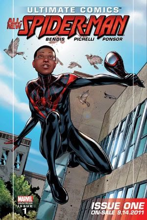 ULTIMATE SPIDER-MAN #1
Writer: Brian Michael Bendis
Artist: Sara Pichelli
Publisher: Marvel Comics
“We had to fight. Boys shouldn't have to fight the way we had to. You shouldn't have to see half the stuff we did. You—you learn. You study. And you make the world the way you want it to be, not the way it is.” -- Uncle Aaron
The media blitz over the “New” Spider-Man was something that caught my attention and made me interested in trying out this series. The thing about “reboots” and “alternate worlds” that appeals to me is that the conceptual rules should be able to be thrown out the window. When the Ultimate Comics line was first announced, I didn't like it because with the SPIDER-MAN book that kicked it off, there was not much changed in any substantive way as far as I could tell. In other words, from my point of view, it became a pointless appendage to the other SPIDER-MAN titles. If Peter Parker is essentially going to be the same person he is in the regular Marvel titles except that he's a little younger, I don't see the justification for the ULTIMATE SPIDER-MAN comic book. At least when THE ULTIMATES #1 was published, I began to get a better sense of Marvel accomplishing what they claimed to be doing with the Ultimate line of titles. But ULTIMATE SPIDER-MAN's appeal continued to elude me throughout the years. It took them 10 years to get to a point with the ULTIMATE SPIDER-MAN title to pique my interest and that was the death of Peter Parker and now the relaunch of the title with a new youngster, Miles Morales, taking up the mantle of Spider-Man in the Ultimate Universe.

Finally, they are taking the bull by the balls and doing something that takes full advantage of the freedom inherent in an “alternate” universe and I am here to read it and fully expecting to enjoy it.
I've read it. Now, let's talk about it for a little bit.
Right off the bat, let me state, Brian Bendis is clearly a talented writer and Sara Pichelli is a good artist and visual storyteller. However, I just have to say I can not seem to muster any appreciation for the way that Bendis structures and paces his stories. I've noted it before with other comics, but I find every Bendis comic I've read to be a ponderous chore to sit through. So, as a general rule, I tend to avoid them. Here, though, I was hoping that there would be an enthusiasm on his part in introducing his new character to the world that would be infectious and pull me in. There are some positive things about the comic, but overall I was underwhelmed and disappointed.
The basic gist of what happens, for those who want the spoilers, is the cover showcases the “new” Spider-Man costume. You open the comic to a scene from 11 months ago to show how genetically modified spider #42 got loose from its box in Norman Osborn's laboratory. Jump to current day and, someone I assume from his costume to be, the “Ultimate” Prowler is breaking into a vault at the abandoned Osborn lab to steal money and valuables when spider #42 hitches a ride in his bag. Jump to Brooklyn and meet middle school student, Miles Morales, who is waiting with his parents to see if his lottery number, 42 (naturally), gets pulled granting him entry into a fancy, schmancy charter school. I'll let you just take a guess about whether his number got pulled. Miles heads over to his ne'er-do-well Uncle Aaron's apartment to hang out. Aaron is apparently also the “Ultimate” Prowler and Miles goes snooping through his goody bag and gets bitten by spider #42, has a seizure, and passes out. Miles' dad comes over and lays in to Aaron, blaming him for whatever just happened to his son. Miles runs out of the apartment and then finds himself on the last pages standing outside but his body is, sort of, camouflaging itself against the concrete and graffiti and he looks at himself and says “Whoa.”
To be continued...
That's it in a nutshell. It ends rather abruptly. Almost like you're watching a tv-show or movie and the power goes out right in the middle of it. It didn't make any structural sense to end it like that and made me immediately go back and count the number of pages because I thought I must have missed something. Nope. 20 pages of story at $3.99 and cut it off right in the middle of the story. Now I understand why they wrapped the comic in plastic – so nobody could thumb through it and, y'know, know what they were buying. The rest of the comic was a 9/11 reprint.
That was a burn that makes it highly unlikely I will be picking up the next issue because not enough happened in this comic to make me actually give a damn about Miles Morales. In AMAZING FANTASY #15, Stan Lee and Steve Ditko pulled in the reader in 11 pages and made them care enough about Peter Parker to justify spinning the character off into his own title and now he is one of the most famous fictional characters in history. At the laborious Bendis-pace, there's no telling when we might come to care about Miles.
The art by Pichelli, is good for what it is. Unfortunately, it's that dull, static, storyboard-style storytelling that Bendis seems to demand of his artists and I think this artist has the ability and the talent to really take this story up a notch in terms of drama and excitement if she wasn't so bound by these thick black rectangular borders that are restraining the action.
I'm not hating on it in general. Conceptually, I think the idea of a poor brilliant Brooklyn kid with an uncle who's a thief with a heart of gold, is a good foundation for building a new twist on the Spider-Man legend. I didn't care for how it unfolded. I also thought the manner in which the spider escaped and got to Miles in the first place was especially hackneyed. I would've liked to have seen some better connection to Peter Parker than an Osborn spider that just happened to sneak out of a box because a scientist was distracted. I was imagining something more along the lines of a kid a bit older than Miles in this comic perhaps hacking his way into an online folder where Parker had kept an encrypted file with details about his biological transformation, blood details, formula for webbing, etc. Then watch this kid get to work and break the encryption and yada yada yada, driven by some plot device (family in danger, or something like that) to subject himself to, oh, maybe an untested spider-serum or something.
No such luck. Instead we get what we got. Maybe it all reads better in the final trade collection, but as a first issue of an ongoing series it was a nice-looking package but wafer-thin on content and a truncated story. Definitely not worth $3.99 by any stretch, even with Bendis's HITCHHIKER gag use of the number 42 – the answer to the “Ultimate Question of Life.” Ha.......ha.
|
| Look for this and other reviews tomorrow @AICN Comics! |
Saturday, September 3, 2011
What SHOULD have been in the DC Relaunch: METAMORPHO: THE ELEMENT MAN

I am not a participant in Morris's DC Fifty-TOO, but I loved the idea and on another website I participate on occasionally a smaller group of us decided to do our OWN cover designs and concepts. I chose "METAMORPHO: THE ELEMENT MAN." Probably second only to Green Lantern in terms of my hierarchy of favorite DC heroes (though the way DC has been portraying GL recently, I may be moving Metamorpho to the number 1 spot).
This is my cover art and the series concept I envision is that Metamorpho is sort of a type of "Alchemical Messiah" empowered by the Orb of Ra. He's torn between the thrill of power and adventure versus the vanity of the loss of his humanity and looks. Java, of course, is jealously in love with Sapphire who is still in love with Rex in spite of what has happened to him. Sapphire is still heiress to the Stagg empire but, in an attempt to make her way out of the shadow of her father, became an NBI agent. She still functions as an at-large agent working with international agencies on behalf of the U.S. in investigating and taking down global threats. She thinks she employs Java as her own personal bodyguard and assistant. But in truth, Java is controlled by Sapphire's sinister father, Simon, who has his own secret agenda in play. What role the fugitive Dr. Will Magnus and his mysterious "Metal Men" play in this drama is unknown, but Doc Magnus seems particularly interested in this "Metamorpho."
Tuesday, August 30, 2011
Don't Bother With the New JUSTICE LEAGUE. COMICS REVIEWS FOR THIS WEEK.

Writer: Geoff Johns
Artists: Jim Lee (pencils) & Scott Williams (inks)
Publisher: DC Comics
***CAUTION: SPOILERS ABOUND***
“Hold on a second...you're not just some guy in a bat costume are you? Are you freaking kidding me?!” – Green Lantern to Batman.
Well, as expected, I am clearly not the audience that this comic book is intended for. I really tried to just enjoy it on it's own merits, but it's such a lousy piece of work, I find it impossible to generate any sense of enthusiasm for it or for anything else on the horizon of the DC overhaul. I hesitate to call it a “reboot” or a “relaunch” anymore since nobody on staff there seems to be able to consistently define what exactly they are doing other than marketing it in contradictory ways.
This is the first issue of the JUSTICE LEAGUE. It is also the first issue of the “New” DC. DC 3.0 if you will. (DC 1.0 being everything up to CRISIS and DC 2.0 being everything post-CRISIS up to post-FLASHPOINT.) It is also one of the most stilted, disjointed inconsistent messes I've read from DC this side of FINAL CRISIS. The story, as it is, starts in Gotham City with Batman chasing after a monster (who looks somewhat like Sleez from John Byrne's ACTION COMICS days) who turns out to be some sort of minion of Darkseid and blows himself up for no real obvious reason. Well, I take that back. The reason is he is the plot complication that draws Green Lantern to Gotham so he can meet Batman. See, GL is the protector of this space sector and got tipped that an “extraterrestrial” threat had appeared in Gotham. So, he flew straight away to check it out.
 Yeehaw! Green Lantern? Meet Batman. Batman? Meet Green Lantern. Much awkward exposition and insipid back-and-forths between the two of them. Apparently, in DC 3.0, GL is (or was 5 years ago, when this was set) is a moron and talks way too much. I had high hopes that in DC 3.0, maybe Batman wouldn't be an asshole. I was wrong. Batman 3.0 is a vigilante who works outside the law and there's a monster running across the rooftops, so understandably the Gotham City Police Department is chasing after both of them. Which is their job!! But that doesn't dissuade asshole-Batman from calling them “idiots”....for FRIGGIN' DOING THEIR JOB!!!!
 |
| Yes. Moron Green Lantern just said "It combusted into fire." Next he's going to tell us that an ice cube "Melted into water" or that the water "Evaporated into gas" or "Froze into ice." |
The two of them, Batman and GL, make the brilliant deduction that since the suicide bomber was an extraterrestrial, then they should team up, hold on to the Mother Box left behind, and head to Metropolis to talk to that “Superman” guy that “they say” is an.......”alien.” Which also makes me wonder, looking at these pages again, just exactly how Batman realizes that the Mother Box is not a “bomb” but more like an alien computer. How much experience does this Batman have with alien technology? They just watched “Sleez” blow himself up, why wouldn't they be more cautious with that thing?
Interlude with Vic Stone. These pages of the football game and the spectators in the stands are the stiffest and most lackluster pages in the book. This is when this title could have really benefited from someone who has a stronger ability to move back and forth between action and personal/emotional moments.
 |
| The "Victor Stone" I recognize. |
On into Metropolis where moron GL instantaneously gets his ass kicked by a red and blue blur. Last panel is our first “exciting” view of Superman 3.0.
 This comic has a lot riding on it. Essentially, it sets the tone and spirit of the v-notched-high-collared DC 3.0. The world I found myself in was younger for sure, but it wasn't much different in tone or spirit than DC up till now. I found myself surprised that this was written by Geoff Johns. It didn't feel like Johns to me. The dialogue was terrible and the manner in which it unfolded just did not flow naturally or organically to me. It felt like it was cribbed off a flow chart of plot and character bits. I got no sense of passion or thrill. The interaction between GL and Batman was terrible. GL delivers exposition out the wah-zoo and comes off stupider than Ryan Reynolds' version of Hal Jordan. Batman just groused his way through the scenery with his grouchy, stubbly chin. This sense of each of these characters (GL, Bats, Supes) approaching each other like they're comparing genital-sizes rang false and immature. These are our heroes now. Are they supposed to be 14 years old? They seem to talk at each other like they are. The retelling of Vic Stone's pre-Cyborg life was dull and uninteresting. Whereas, in the original NEW TEEN TITANS series, the character of Vic Stone and his family dynamic was one of those elements that endeared him to me. In this comic, I didn't recognize him as the Victor Stone I once knew. It was just a generic “troubled” character.
I think Geoff Johns was attempting to swipe from SEVEN SAMURAI/MAGNIFICENT SEVEN to create a classic story of how 7 disparate characters could all get drawn together against a common enemy. However, with the use of Darkseid as an other-worldly “god” who winds up drawing our characters together, he actually absent-mindlessly just cribbed from Marvel's AVENGERS for the JUSTICE LEAGUE version 3.0 with Darkseid filling in for the Loki role.
 I was really hoping for something more substantial and truly new in approach. This was, unfortunately, just the TACO BELL JUSTICE LEAGUE, where they look at the ingredients they already have on hand, mix them up and rearrange them, and claim an “all-new” menu. But it's really just the same old tacos and burritos.
Artistically, I found the comic to be mostly sketchwork-level with massively overdone coloring work. Much of the action was hard to follow. The flow of the work from panel to panel was inconsistent and was at times distracting. The details on Batman's annoying armored costume come and go from panel to panel. GL has irrelevant seams and/or armor on his chest and arms that makes no sense with the rest of the costume where the boots and gloves look like cloth. Either go organic like the recent film, or cloth like in 1.0 and 2.0, or go construct-armor style. The inconsistent blend of the two is distracting. Superman looks like Ultra-Man now.
I've seen some of Jim Lee's pencils, which were stronger than the stiffness and sketchiness here, so I may have to lay blame on Scott Williams' inking for some of my disappointment. The color work made some panels not only difficult to distinguish what was happening, but just plain hurt my eyes. I'm not sure why some modern colorists don't realize that just because you CAN do photoshop effects doesn't mean you HAVE to do them. In fact, that last page reveal of Superman is an example of terrible texturing and effects unnecessarily intruding on what should be the most exciting panel in the book.
 I was honestly planning on getting the trade for this book because I usually like Geoff Johns's writing and Jim Lee's art. But now, I think I'll just move on to something else.
Reading this comic reminded me of a line from The Who when they sang “Meet the new boss/Same as the old boss.” And remember the title of the song? I hereby nominate “We Won't Get Fooled Again” as the theme song for the DC Comics fans.

FLASH GORDON: INVASION OF THE RED SWORD PART 4: POWER
Writer: Brendan Deneen
Artist: Eduardo Garcia
Publisher: Ardden Entertainment
“FLASH GORDON?!” – King Crax of the Fire People
“Uh..yep, that's me. Unless you want to kill Flash Gordon. In which case, I hate that guy too.” – Flash Gordon
In a week in which one major publisher hits blitzes the comic shops with their insanely over-hyped relaunch, there's a slight...ever so miniscule....chance that some lesser hyped comics might get overlooked. In this case, one that might get overlooked might be Ardden Entertainments current FLASH GORDON series. So, let me take a moment to remind you that this comic is also available today at your local comics retailer.
I hear a lot of grousing (and sometimes do the grousing myself) about the absence of fun and adventure in modern comics. I keep looking forward to this series every month precisely because it fills that void. It is possible to tell a serialized adventure series in comics without on panel rapes, graphic beheadings and amputations. It is possible to entertain the hell out of your reader without rotting corpses and psychopathic over-the-top villains. It is possible to tell a long-form story in serialized form that is complete on its own yet continues the larger story and it is possible to do proper character development without crossovers and tie-ins. FLASH GORDON demonstrates this every month, consistently.
As it should, this comic moves from cliffhanger to cliffhanger each month and is a thrilling ride every time. The invasion of the planet Mongo by the bloodthirsty humans of The Red Sword is in full force right now and our heroes (and villain) are separated and struggling to survive. As the anticipation builds in the story, so does the anticipation in the reader as to if and when our team will reunite and quell this invasion. More importantly, how can they rebuff the Red Sword without reestablishing Ming as the powerful Emperor of Mongo.
The difficult thing is to write about an issue like this without overly spoiling it, but at the end of the previous issue, Flash found himself abandoned by his “partner” Ming (no surprise there) to drown in a flooding cave. Since the comic is eponymously titled, it should come as no surprise that Flash figures a way out of his predicament, but then he finds himself once-again face-to-face with a fire-breathing dragon. This creatures seem to be rather common on Mongo.
Dale Ardden, Vultan, and his daughter Talon meet a race of men I, at least, am unfamiliar with – The Power Men of Mongo. Another fascinating extrapolation of beings in that The Power Men are cyborgs on the run from the brutal rule of Ming. Threads of story are picked up from the FG: MERCY WARS and Queen Fria of Frigia.
In other words, a whole lot happens in this one comic book. And this has been the pattern for the entire series. This is seriously one of the best paced books out there, as are all the Arrden and Atlas comics, in that it mirrors the active storytelling of the old movie serials but actually involves the reader in the lives and the personalities of the people of Earth who are stranded on Mongo, but especially those who are native to Mongo.
Ming is missing from this issue, but his presence is like an umbrella covering the entire proceeding. The series is called FLASH GORDON, but Ming is the character who keeps it focused at all times.
Every time I review this series, I always make a point of complimenting the art. The thing about the artist, Eduardo Garcia, is that he came on to this series following an artist who had already established the look and the style for it. That's a tough place to find yourself in as an artist. What I have noticed from issue to issue is that each successive issue begins to look less like Garcia is trying to match that earlier style and more organically Garcia himself. And that's a progression that I whole-heartedly approve of. I enjoy his work and he's a fantastic graphic storyteller. I also will take a moment to rave about the color work once again. It always strikes me how other-worldly Mongo seems. It really looks like the reader is viewing these scenes through the light of a sun and planet quite different from our own. And these color and lighting choices are deliberate and effective. If you're already reading this series then you know what I'm talking about. If you haven't picked it up yet, this is a good time to jump in because you can get all four issues and be up to speed before the next one comes out.
AND DON'T FORGET TO CHECK OUT THESE AND OTHER COMICS/GRAPHIC NOVEL REVIEWS AT AINTITCOOL.COM
They are a great bunch of guys who really tell it they way they feel it,
and that's hard to come by in the comics reviewing market.
Subscribe to:
Posts (Atom)